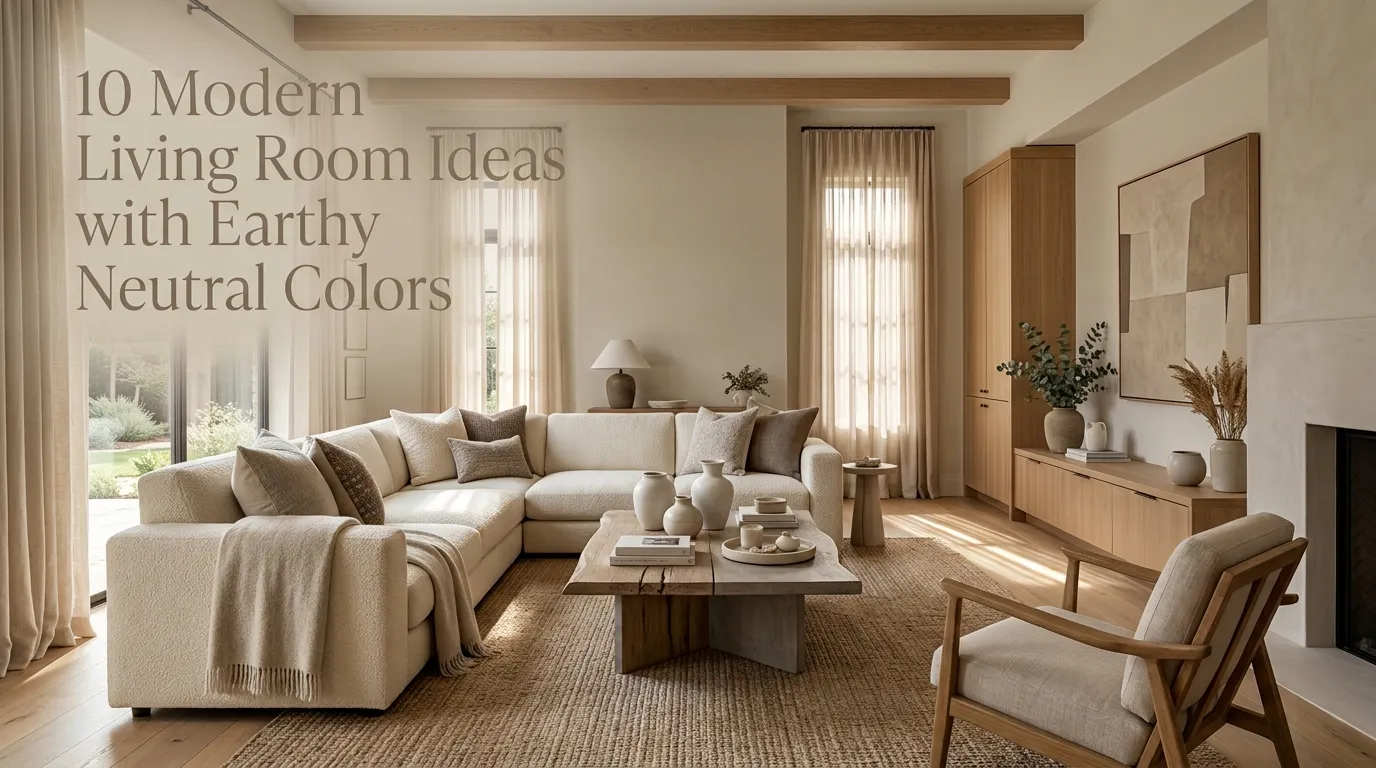
10 Modern Living Room Ideas with Earthy Neutral Colors
A living room can look modern without feeling cold, stark, or overly decorated. In fact, some of the most inviting contemporary spaces rely on a surprisingly simple combination: warm neutrals, natural textures, comfortable furniture, and thoughtful layers of light.
Earthy shades such as sand, taupe, warm white, mushroom, clay, beige, olive, and soft brown bring a grounded quality to a room. They work especially well in living spaces because they create a calm backdrop while leaving plenty of room for personality. Whether you live in a compact apartment, a suburban home, or a spacious open-concept house, this palette can adapt beautifully to different layouts and decorating styles.
The trick is avoiding a room that feels flat. A collection of beige furniture and cream walls alone can lack dimension. Modern earthy decorating works best when several related tones and tactile materials work together. Think linen beside wood, woven baskets beside smooth ceramic, boucle beside leather, or a softly textured rug beneath streamlined furniture.
I’ve noticed that one of the easiest ways to make a neutral living room feel intentional is to focus on contrast rather than color intensity. A light wall against medium wood, a soft sofa beside a dark coffee table, or a rough stone accessory beside a polished surface can create visual interest without introducing a busy color scheme.
This guide explores ten approachable ways to bring that look into your own home. You’ll find ideas for furniture, walls, lighting, natural materials, artwork, accessories, layouts, and small finishing touches. Some work particularly well for renters, while others are ideal when you’re ready for a larger decorating update.
The goal isn’t to copy one exact room. Instead, use these ideas as building blocks for a comfortable modern space that feels collected, practical, and distinctly yours.
Table of Contents
1. Warm Neutral Palette
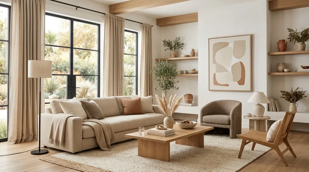
A layered palette of beige, cream, taupe, and soft brown creates a sophisticated foundation without making the room feel monotonous.
2. Natural Wood Furniture
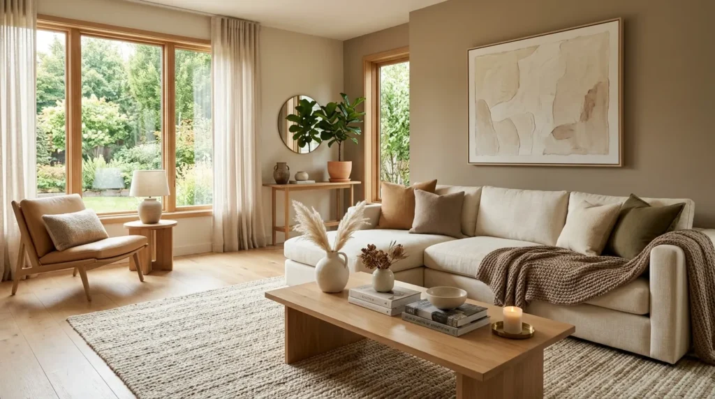
Wood introduces warmth, texture, and organic character while balancing the clean lines commonly found in modern furniture.
3. Textured Linen Seating
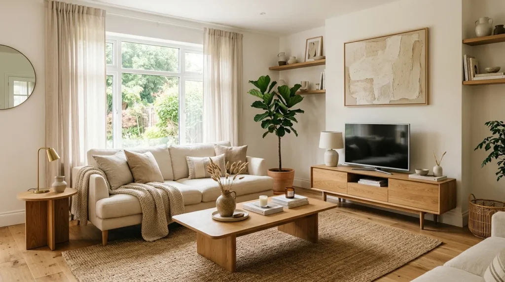
Linen sofas and chairs soften contemporary interiors and add relaxed texture that works beautifully with earthy colors.
4. Stone Coffee Tables
Stone and stone-look surfaces bring an architectural quality to the room while keeping the palette natural and understated.
5. Organic Curved Shapes
Rounded furniture and accessories soften straight architectural lines and create a more welcoming seating arrangement.
6. Earthy Accent Walls
A subtle clay, mushroom, taupe, or warm beige wall adds depth while keeping the overall room calm and versatile.
7. Layered Natural Textures
Rugs, baskets, ceramics, woven accents, and textiles create dimension without relying on bright decorative colors.
8. Olive Green Details
Muted olive introduces a gentle connection to nature while remaining sophisticated enough for a modern living room.
9. Sculptural Lighting
Modern lighting becomes part of the decor, adding shape and atmosphere while making the neutral palette feel more dimensional.
10. Minimal Styled Shelves
A carefully edited collection of books, ceramics, artwork, and organic objects gives the room personality without creating visual clutter.
1. Warm Neutral Palette
Quick Benefits
- Creates a calm and welcoming foundation
- Makes modern furniture feel softer
- Works with many decorating styles
- Makes natural materials stand out
- Allows seasonal accessories to change easily
Why It Works
Warm neutrals create a quiet backdrop that makes a modern living room feel comfortable rather than clinical. Instead of relying on a single shade of beige, combine several tones that sit close together on the color spectrum. Warm white can brighten the walls, taupe can anchor the upholstery, camel can add richness, and medium brown can provide definition.
This approach works because the room gains depth through subtle tonal differences. The eye moves from one surface to another without encountering a harsh visual interruption. It also gives natural materials room to shine. Wood grain becomes more noticeable against creamy upholstery, while woven fibers look especially appealing beside smooth painted walls.
A mistake many homeowners make with neutral rooms is choosing every major piece in nearly identical shades. The result can feel washed out. A more polished approach uses a light, medium, and dark value throughout the room. Even a mostly cream space benefits from a few deeper brown or charcoal elements.
How To Style It
Start with the largest surfaces first. Choose a warm white, ivory, beige, or light mushroom wall color, then select a sofa in a slightly deeper neutral. Add a rug that combines two or three related shades rather than one completely solid color.
For furniture, medium or light wood works particularly well. A brown leather accent chair can introduce another layer of warmth without disrupting the palette. Finish the seating area with pillows in oatmeal, camel, soft brown, and subtle geometric patterns.
Keep the strongest contrast toward the lower half of the room with a coffee table, rug border, or darker furniture legs. This helps visually ground the space.
If the room receives limited daylight, lean toward lighter warm neutrals. In a bright room, deeper taupes and mushroom tones can create a richer atmosphere without making the space feel heavy.
2. Natural Wood Furniture
Quick Benefits
- Adds warmth to contemporary spaces
- Introduces natural visual texture
- Works with neutral upholstery
- Creates a grounded appearance
- Complements both light and dark rooms
Why It Works
Clean-lined modern furniture can sometimes make a living room feel overly polished. Natural wood immediately brings back a sense of warmth and imperfection. Visible grain, knots, and tonal variation make the room feel more organic and lived-in.
Wood is especially effective with earthy neutrals because both share naturally warm visual qualities. A pale oak console can brighten a taupe room, while walnut furniture provides richer contrast against cream walls. The material also bridges the gap between modern minimalism and more relaxed decorating styles.
The key is choosing wood tones intentionally. A room can become visually confusing when several unrelated wood finishes compete for attention. You don’t necessarily need every piece to match, but the undertones can relate to one another.
A simple oak coffee table, wooden media console, or pair of side tables can make a substantial difference without requiring a complete furniture replacement.
How To Style It
Choose one primary wood tone for the larger furniture pieces. Oak, ash, walnut, and medium-toned natural wood all work well with earthy neutral palettes.
For a lighter room, try an oak coffee table with rounded edges, a matching console, and a few smaller wood accessories. For a moodier space, walnut can create a sophisticated contrast against warm ivory walls and beige upholstery.
Avoid filling every surface with wooden objects. Instead, allow the grain to remain visually special. Pair a wood table with ceramic vases, linen textiles, or stone accessories.
A wood-framed mirror is another useful addition, especially in smaller rooms. It adds warmth while reflecting light. In open-concept spaces, a wooden console can also help define the living area without creating a visual barrier.
If you’re furnishing a rental, small wood pieces such as nesting tables, stools, frames, and trays can provide the same effect without permanent changes.
3. Textured Linen Seating
Quick Benefits
- Adds relaxed texture
- Softens contemporary furniture
- Creates an inviting atmosphere
- Works beautifully with earthy colors
- Suitable for casual everyday spaces
Why It Works
Texture matters enormously in a neutral room. When color differences are subtle, tactile differences become more noticeable. Linen is particularly useful because its natural weave adds quiet visual movement without looking busy.
A linen or linen-look sofa in cream, oatmeal, beige, or warm gray can become the foundation of a comfortable modern living room. The slightly relaxed appearance of the fabric also balances sharper elements such as metal lighting, glass tables, or minimalist artwork.
This is one of those decorating choices that looks simple in photographs but has a major effect in person. The fabric catches light differently across the surface, creating gentle variation throughout the day.
For households that use the living room heavily, look for upholstery designed for everyday use and follow the manufacturer’s cleaning recommendations. Beautiful fabric is only practical when it suits the way the room actually functions.
How To Style It
Begin with a simple sofa shape rather than an overly ornate silhouette. A low-profile linen sofa with clean arms can feel contemporary while remaining comfortable.
Layer cushions in complementary materials. Try cotton, boucle, woven fabric, and soft wool alongside linen. Keep the colors within a narrow earthy range so the different textures become the main attraction.
A large textured throw can be draped casually over one corner of the sofa. Choose oatmeal, camel, cream, or muted brown rather than introducing a highly saturated accent.
If you have children or pets, consider performance upholstery or washable covers where available. Practicality doesn’t have to interfere with the aesthetic.
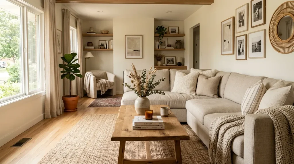
Pair the sofa with a natural-fiber rug and wood coffee table for a relaxed look. For a more refined arrangement, add a sculptural side table and oversized neutral artwork.
The overall effect is comfortable enough for everyday life but polished enough to feel intentionally designed.
4. Stone Coffee Tables
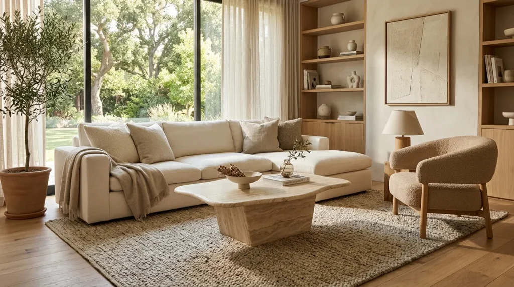
Quick Benefits
- Adds natural character
- Provides a strong focal point
- Complements warm neutral colors
- Balances soft upholstery
- Brings an architectural quality to the room
Why It Works
A coffee table often occupies the visual center of a living room, so changing this one piece can dramatically influence the overall atmosphere. Stone introduces a solid, tactile element that contrasts beautifully with soft fabrics and warm wood.
Travertine, limestone-inspired finishes, marble, and other natural or stone-look surfaces can all work with an earthy palette. Their subtle variation keeps the room from feeling too uniform.
Stone also has a naturally grounded appearance. It can make lightweight furniture feel more substantial and gives a modern space an architectural quality without requiring dramatic decorative elements.
If genuine stone isn’t practical for your budget or lifestyle, stone-look materials can provide a similar visual effect. The important consideration is proportion, texture, and how the surface relates to the rest of the room.
How To Style It
For a spacious living room, a large rectangular stone table can anchor a generous seating arrangement. In a smaller room, consider a round or oval table to improve circulation around the furniture.
Pair pale stone with darker wood for contrast. A cream stone surface beside a walnut sofa table creates a sophisticated balance between light and dark. Alternatively, combine warm beige stone with oak for a softer monochromatic appearance.
Keep the tabletop styling restrained. A low ceramic bowl, a stack of neutral books, and a small organic arrangement are usually enough.
If your household needs flexible furniture, nesting tables can offer additional surface area without permanently filling the room.
Pay attention to the scale of the table in relation to the sofa. A table that is too small can make a large sectional look unbalanced, while a table that is too large can interfere with movement.
The best coffee table feels like a natural extension of the seating area rather than an isolated decorative object.
5. Organic Curved Shapes
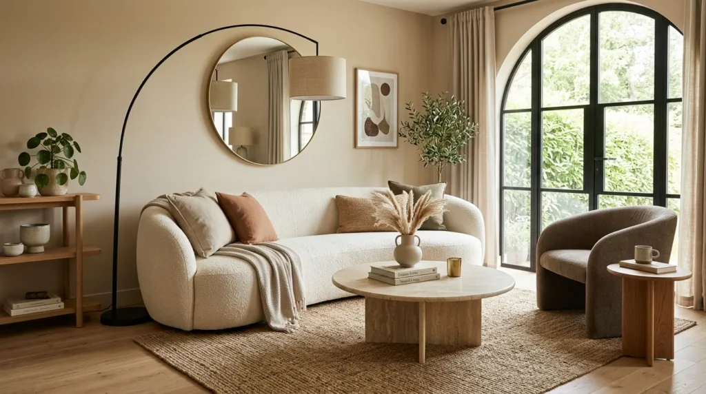
Quick Benefits
- Softens straight modern lines
- Makes seating feel more inviting
- Improves visual flow
- Adds contemporary character
- Works well in open layouts
Why It Works
Modern interiors often feature strong horizontal and vertical lines. Straight sofas, rectangular rugs, shelving, windows, and cabinets can create a structured appearance, but too many hard edges may make a room feel rigid.
Curved forms introduce visual softness. A rounded coffee table, curved sofa, circular mirror, arched floor lamp, or sculptural chair can create contrast without adding another color.
The result feels modern but more relaxed. Curves also encourage the eye to move around the room rather than stopping at repeated corners.
This approach is especially useful in living rooms where comfort is a priority. Rounded furniture tends to create a more conversational feeling, particularly when seating is arranged around a central table.
You don’t need an entire collection of curved furniture. One or two thoughtfully chosen shapes can be enough.
How To Style It
Start with one major curved piece. A round coffee table is often the easiest option because it fits naturally into many existing layouts.
If your sofa is straight, add a curved accent chair nearby. An arched floor lamp or round mirror can repeat the shape without making the room look themed.
For a sectional, a large circular or oval coffee table can soften the strong geometry and make the seating arrangement feel more cohesive.
Keep the surrounding materials simple. Curves already create visual interest, so pair them with quiet upholstery, natural wood, stone, or matte ceramics.
In a smaller living room, rounded tables can also make the pathway around furniture feel easier to navigate because they don’t have sharp corners extending into walking areas.
For renters, curved accessories offer an inexpensive way to introduce the trend. Try a round mirror, circular tray, rounded lamp, or ceramic vessel before changing larger furniture.
6. Earthy Accent Walls
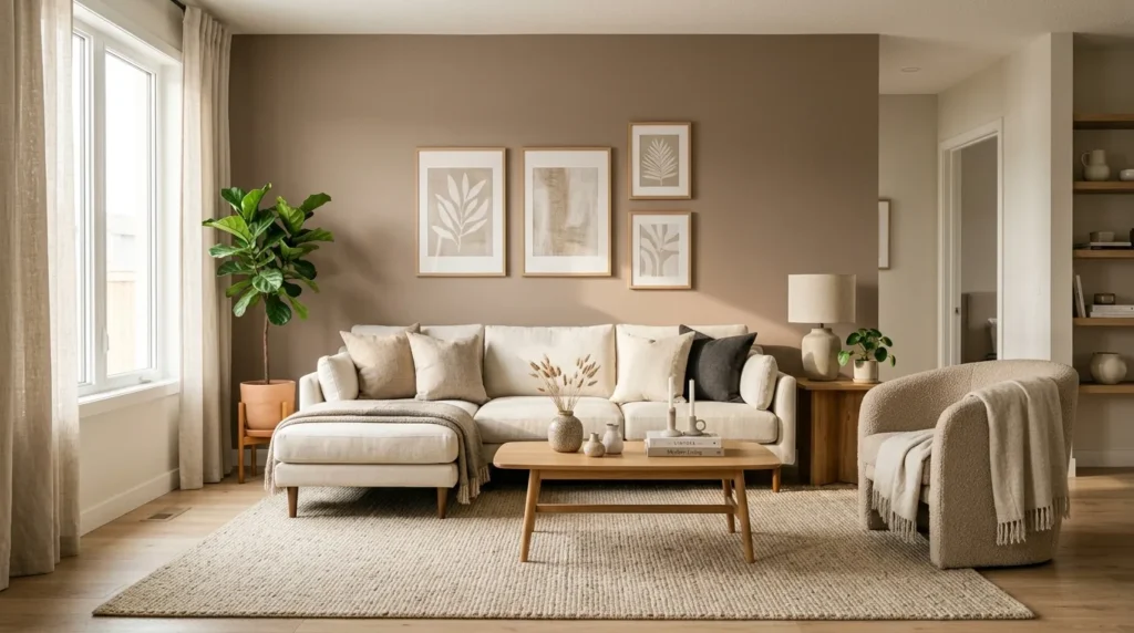
Quick Benefits
- Adds depth without bright color
- Creates a natural focal point
- Defines a living area
- Works with neutral furniture
- Can change the room’s mood dramatically
Why It Works
An earthy accent wall can give a neutral living room much more architectural presence. Instead of using a dramatic saturated color, choose a muted shade inspired by natural materials.
Clay, mushroom, warm taupe, sandy beige, muted olive, and soft terracotta can all create depth while remaining sophisticated. These colors are particularly effective when the rest of the room stays light and restrained.
An accent wall can also help define a feature area. It might sit behind the sofa, fireplace, television console, or built-in shelving. In an open-concept home, a deeper wall tone can visually establish the living room without requiring physical partitions.
The most successful accent walls don’t feel like isolated blocks of color. Their tones appear elsewhere through textiles, wood, artwork, or accessories.
How To Style It
Choose the wall based on the room’s architecture. A wall with a fireplace, built-in shelving, or large artwork often makes a natural focal point.
If you’re working with a warm neutral palette, consider a soft mushroom or clay-inspired color. For a nature-focused look, muted olive can create a beautiful connection with greenery and wood.
Keep adjacent walls lighter so the accent wall has room to breathe. Then repeat the accent tone in small amounts around the room through pillows, artwork, pottery, or a throw.
Before painting, test samples at different times of day. Natural and artificial light can significantly change how a neutral paint color appears.
Renters can create a similar effect with removable wallpaper or large-scale textile panels where appropriate.
Avoid adding too many competing decorative elements to the feature wall. One large piece of artwork or a carefully styled console often creates more impact than a crowded collection.
7. Layered Natural Textures
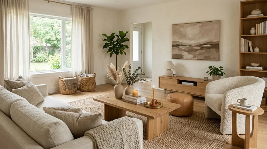
Quick Benefits
- Prevents neutral rooms from feeling flat
- Adds visual depth
- Makes the space feel comfortable
- Creates a handcrafted quality
- Works across multiple decorating styles
Why It Works
When a room uses mostly neutral colors, texture becomes one of the strongest design tools. Natural fibers, woven materials, ceramics, wood, stone, linen, wool, and leather each reflect light differently.
That variation creates depth without requiring dramatic color. A cream boucle chair next to a woven basket looks more interesting than several smooth cream objects placed together. A jute-style rug under a sleek coffee table creates another layer of contrast.
Texture also helps a modern room feel more personal. Perfectly smooth surfaces can make a space resemble a showroom, while natural imperfections add warmth.
The goal is balance. Too many highly textured objects can become visually noisy. Combine rough and smooth materials so each one has room to stand out.
How To Style It
Begin from the floor upward. Add a large area rug with a subtle woven or natural-fiber appearance. Place your main seating over it, then introduce wood, stone, ceramic, and textiles.
Use baskets for practical storage. A woven basket beside the sofa can hold throws while adding texture. Ceramic vessels can bring a handmade appearance to a console or shelf.
Mix pillow fabrics rather than purchasing every cushion from the same material. Linen, cotton, boucle, and woven textiles create a richer arrangement.
A leather ottoman can introduce another tactile surface and works especially well with warm beige and brown tones.
For decorative objects, favor matte ceramics, carved wood, woven trays, and natural stone over an abundance of glossy accessories.
This layering technique is particularly useful when you want a sophisticated room without a lot of decoration. The materials themselves become the visual interest.
8. Olive Green Details
Quick Benefits
- Introduces a subtle natural color
- Complements warm neutrals
- Works with wood beautifully
- Adds visual depth
- Keeps the palette sophisticated
Why It Works
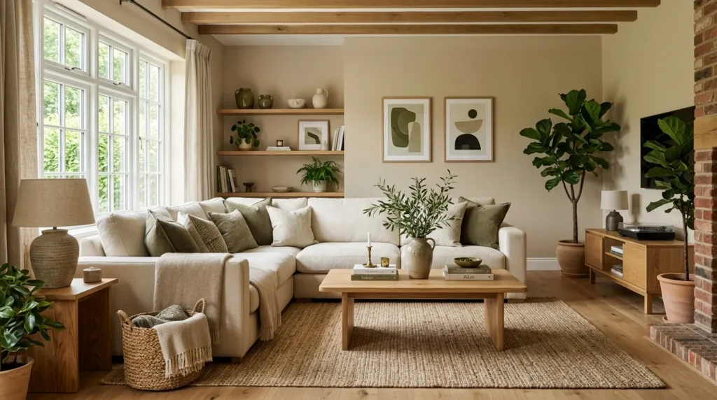
Earthy neutral doesn’t have to mean completely colorless. Muted olive green can act almost like a neutral when used carefully. Its connection to foliage makes it particularly effective alongside beige, cream, brown, and natural wood.
Unlike bright green, muted olive tends to feel quiet and mature. It can add enough contrast to keep a room interesting without changing the entire color story.
This shade also works across different design styles. In a contemporary room, olive can appear through a single accent chair or cushion. In a more organic interior, it can be repeated through plants, artwork, textiles, and ceramics.
The secret is restraint. Olive works best when it feels like a supporting note rather than the dominant color.
How To Style It
Use olive in two or three places around the room. For example, combine an olive cushion with a small piece of artwork containing muted green and a leafy plant nearby.
If you want more impact, an olive accent chair can become the statement piece against a warm cream sofa.
Pair olive with natural oak for a lighter, fresher look. Walnut creates a deeper, moodier combination.
For a small living room, keep the walls and larger furniture light and use olive through accessories. This preserves the sense of openness.
Plants provide another natural way to bring green into the room. Choose greenery based on your home’s actual light conditions rather than selecting plants solely for appearance.
A few thoughtfully placed green details can make a neutral living room feel connected to the outdoors without sacrificing its modern character.
9. Sculptural Lighting
Quick Benefits
- Adds personality to neutral interiors
- Creates visual height
- Improves evening ambiance
- Introduces interesting shapes
- Makes the room feel more finished
Why It Works
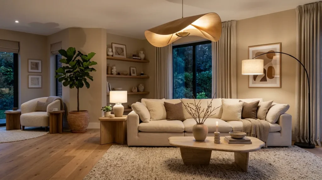
Lighting is more than a functional necessity in a modern living room. A distinctive fixture can act as artwork while also changing how every other surface appears.
This becomes particularly important in earthy neutral rooms because warm lighting enhances the natural qualities of beige, wood, stone, and textured fabrics. During the day, a sculptural fixture adds shape. In the evening, it creates pools of light that make the room feel layered and intimate.
A common decorating mistake is relying entirely on one ceiling fixture. A living room usually feels more comfortable when illumination comes from several heights.
Floor lamps, table lamps, wall lights, and ceiling fixtures can work together to create a flexible atmosphere.
How To Style It
Start with the room’s primary light source, then add secondary lighting around the seating area. A tall floor lamp beside a sofa can create height, while a table lamp on a console adds a lower point of light.
Look for fixtures with organic silhouettes, linen shades, aged metal, ceramic bases, or natural wood details. These materials complement an earthy palette without overwhelming it.
Warm-toned bulbs can create a cozy evening atmosphere. Check the fixture and bulb specifications to choose lighting appropriate for the space.
If your living room has high ceilings, a large sculptural pendant can help fill the vertical space. In a smaller room, a curved floor lamp or compact table lamp can provide similar character without dominating the layout.
Place lighting where it serves an actual purpose. A reading chair benefits from focused illumination, while ambient lamps around the sofa create a relaxed social setting.
The best lighting plan combines beauty with everyday function.
10. Minimal Styled Shelves
Quick Benefits
- Adds personality without clutter
- Creates useful storage
- Provides space for artwork
- Highlights natural materials
- Keeps the room visually organized
Why It Works
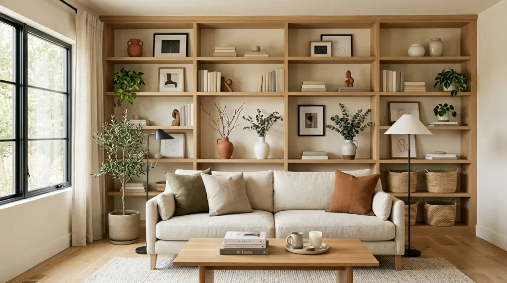
Minimal shelving doesn’t mean leaving every shelf empty. It means selecting fewer objects and giving each one enough space to be noticed.
This is particularly effective in earthy modern rooms because a small collection of natural materials can create a beautiful display. A ceramic vessel, wood sculpture, neutral book stack, framed artwork, and small plant can tell a visual story without making the shelving feel crowded.
Shelves also provide an opportunity to repeat colors and materials from the rest of the room. If your coffee table features stone, for example, a small stone object on a shelf can create subtle continuity.
The most appealing displays usually contain a mixture of heights and shapes. Repeating the same size and object type across every shelf can make the arrangement feel too rigid.
How To Style It
Start by clearing the shelves completely. Then place the largest objects first. These might include artwork, a tall ceramic vase, or a substantial basket.
Next, add medium-sized objects and finish with a few small pieces. Leave empty areas between groupings so the display can breathe.
Use books as both functional objects and visual layers. Stack two or three neutral-toned books horizontally beneath a ceramic piece, then place a vertical book group nearby for contrast.
Keep the color palette consistent with the rest of the room. Cream, tan, brown, olive, black, and muted clay shades can work together without making the shelves visually chaotic.
For open shelving near a television, avoid filling the entire wall with accessories. Negative space helps the room maintain a modern appearance.
Rotate a few decorative objects seasonally rather than constantly adding more. This keeps the display fresh while preventing unnecessary clutter.
How To Balance Earthy Neutrals in a Modern Living Room
The most successful neutral living rooms usually contain more variation than they initially appear to have. The palette may look simple, but several elements are working together underneath it.
A useful starting point is the 60-30-10 approach, adapted for a softer neutral palette. About 60 percent of the room can sit within your primary light neutral, 30 percent can come from a secondary warm tone such as taupe or natural wood, and the remaining 10 percent can provide contrast through brown, olive, black, or clay.
This doesn’t have to be mathematically exact. Think of it as a visual guideline.
For example, imagine warm ivory walls, a beige sofa, an oatmeal rug, natural oak furniture, walnut accents, olive cushions, and a few matte black details. Nothing is especially bright, but the room still has depth because the values and textures vary.
Choose Undertones Carefully
Not all beige is the same. Some neutrals have pink, yellow, gray, or green undertones. Combining unrelated undertones can make a room look mismatched even when every individual piece is attractive.
If your walls have a warm undertone, test upholstery and large furniture against them before committing.
Natural daylight also affects the result. A room facing north can appear cooler, while strong southern or western light can make warm neutrals appear richer.
Create Contrast Without Harsh Color
Contrast doesn’t require bright accessories. A dark wood table, black picture frame, brown leather chair, or deep olive cushion can provide enough definition.
This is especially useful when decorating a small room. Too many high-contrast elements can visually break up the space, while a few carefully placed darker accents help anchor it.
Let Texture Do the Work
When the color palette is restrained, materials become more important.
Try combining:
- Smooth painted walls
- Woven rugs
- Linen upholstery
- Natural wood
- Matte ceramic
- Stone surfaces
- Soft wool
- Aged metal
- Leather accents
This mixture keeps the room interesting without making it colorful.
How To Make a Neutral Living Room Feel Cozy
A modern neutral living room can sometimes feel unfinished when the decorating process stops after the major furniture pieces are placed.
Comfort comes from layering.
Start with the seating. A sofa alone can look sparse, while a sofa with two or three carefully selected cushions and a throw feels more inviting.
Next, consider the floor. A properly sized rug helps visually connect the seating area. It also adds softness and can introduce subtle pattern without overwhelming the room.
Then add lighting at different heights. A ceiling fixture handles general illumination, while floor and table lamps create warmth around the edges.
Finally, introduce objects that suggest everyday life. A stack of books, a basket for blankets, a ceramic bowl, framed photographs, or a small collection of artwork can make the room feel lived in.
One simple trick I always suggest is to avoid decorating every surface at once. Live with the room for a few days. Notice where you naturally reach for a lamp, where clutter collects, and which surfaces feel empty. Decorate according to how the room actually functions.
That approach tends to produce a more authentic result than filling every corner immediately.
Small Living Room Tips
Earthy neutral colors are especially useful in small living rooms because lighter shades can keep the visual environment open while natural textures provide depth.
Choose furniture according to the actual dimensions of the room. A compact sofa with exposed legs can visually occupy less space than a deep, heavy sectional.
Use one larger rug instead of several small rugs when possible. A properly sized rug can make the seating area feel unified.
Mirrors can also help reflect daylight and create a sense of openness. Choose a simple wood or neutral frame that supports the room’s aesthetic.
For storage, look for furniture that performs more than one function. An ottoman with hidden storage, a console with drawers, or a nesting table set can make a small room easier to manage.
Keep the number of decorative objects controlled. A small space benefits from intentional negative space.
If you love earthy colors but don’t want the room to feel dark, keep the largest surfaces light and introduce deeper tones through small furniture pieces and accessories.
Modern Earthy Living Room Color Combinations
Choosing a coordinated palette can make the decorating process much easier.
Cream + Oak + Olive
This combination feels light, fresh, and connected to nature. Use cream on the walls or sofa, oak for furniture, and olive in small accents.
Warm White + Taupe + Walnut
This palette creates a more sophisticated and slightly dramatic appearance. Walnut furniture provides the darker grounding element.
Beige + Camel + Clay
Camel adds warmth while muted clay brings subtle color. This combination works especially well with linen and woven materials.
Mushroom + Ivory + Brown
Mushroom provides depth without becoming too dark. Pair it with ivory textiles and medium or dark brown accents.
Sand + Terracotta + Natural Wood
For a warmer room, sandy neutrals and restrained terracotta create an inviting southwestern or Mediterranean-inspired feeling without becoming overly themed.
Soft Gray-Beige + Cream + Black
If you prefer a cooler modern appearance, a balanced greige can work with warm cream and a small amount of black for definition.
Common Mistakes to Avoid
Even a beautiful palette can lose its impact when the room lacks balance.
Using Only One Neutral
A room filled with one beige shade can feel flat. Add several related values and textures.
Matching Everything Too Closely
Furniture sets don’t always create the most interesting room. Mixing complementary materials often creates a more collected appearance.
Ignoring Lighting
A neutral paint color can look completely different under cool artificial lighting. Consider both daylight and evening lighting before making final decisions.
Choosing Furniture Too Large
Comfort matters, but oversized furniture can quickly overwhelm a living room. Measure doorways, walking paths, and furniture clearances before purchasing.
Adding Too Many Decorative Items
Earthy modern design relies on restraint. A few strong pieces often look more intentional than dozens of small accessories.
Forgetting Practicality
A living room is usually a high-use area. Select fabrics, rugs, finishes, and furniture according to how the household actually lives.
FAQ
What colors work best with earthy neutrals in a living room?
Warm white, cream, beige, taupe, camel, brown, muted olive, clay, terracotta, and soft black all pair well with earthy neutrals. The best combination depends on the amount of natural light and the existing finishes in the room. Using several related shades instead of one single neutral creates a more dimensional result.
How do I make a neutral living room look modern?
Use clean-lined furniture, a restrained color palette, natural materials, simple artwork, and intentional negative space. Modern style doesn’t require a completely minimalist room. A combination of warm neutrals, natural wood, sculptural lighting, and carefully selected accessories can create a contemporary space that still feels comfortable.
Are earthy colors good for small living rooms?
Yes. Light earthy shades such as warm white, sand, cream, and pale beige can help a small room feel open. Add medium and darker earthy tones through furniture and accessories to create contrast. Keeping the largest surfaces lighter while limiting visual clutter can help maintain a spacious appearance.
What wood color looks best with beige furniture?
Oak, walnut, ash, and medium natural wood can all complement beige furniture. Oak creates a lighter and more casual appearance, while walnut provides richer contrast. Choose a wood undertone that works with the beige rather than trying to match every piece exactly.
How can I add color without losing a neutral look?
Use muted colors rather than highly saturated shades. Olive green, dusty terracotta, clay, camel, and soft brown can introduce variation while maintaining an earthy aesthetic. Repeat the accent color in two or three small areas so it feels integrated rather than random.
How many colors should a modern living room have?
There is no strict number, but a restrained palette is often easiest to coordinate. Start with a dominant light neutral, add one or two supporting earthy tones, and use a darker shade for definition. Variation in texture and material can create interest without adding many colors.
How do I decorate a neutral living room without making it boring?
Focus on contrast, texture, scale, and shape. Combine linen with wood, stone with soft textiles, rounded furniture with straight lines, and light surfaces with darker accents. Artwork, plants, books, and sculptural accessories can add personality while keeping the overall palette calm.
Conclusion
An earthy modern living room doesn’t depend on a complicated color scheme or a room full of expensive statement pieces. The strongest results usually come from a thoughtful combination of warm neutrals, natural materials, comfortable furniture, varied textures, and carefully controlled contrast.
Start with the foundation. Warm white, cream, beige, taupe, or mushroom can establish a calm backdrop. From there, introduce natural wood, textured upholstery, stone, woven materials, and subtle shades such as olive or clay.
Pay attention to shape as well as color. Rounded furniture can soften a structured room, while sculptural lighting can add personality without creating visual clutter. A few darker accents help ground the space, and edited shelving keeps the final look polished.
Most importantly, decorate around the way you actually use your living room. If the sofa is where everyone gathers, make it comfortable. If books and blankets are part of everyday life, give them attractive storage. If evening relaxation matters, prioritize layered lighting.
You don’t have to transform the entire room at once. Start with one or two ideas that fit your existing furniture, then build gradually. The result can be a living room that feels modern, warm, practical, and personal rather than overly styled.
Related Articles
- 10 Cozy Living Room Ideas for a Warm and Inviting Home
- 10 Small Living Room Ideas with Modern Comfort
- 10 Neutral Home Decor Ideas for a Calm and Timeless Interior
- 10 Modern Bedroom Ideas with Hotel-Inspired Comfort
- 10 Living Room Wall Decor Ideas for a Stylish Modern Home